#MastoArtStudy Exercise N05
Last week we practiced drawing only the shadows of an image with hard shapes and we saw how drawing only shadows already can communicate the shapes we want to depict. This time we’re going to delve a lot deeper in the topic of value and its importance in picking the right colors, and maybe most importantly, how it supports the composition of your artwork.
So last week I talked a bit about value. This time I want to elaborate on saturation. I take it you’re familiar with this term, but just a quick explanation in case you’re not. Take a bright color, let’s say yellow, and slowly sap out the color until you’ve got nothing but grey. The amount of grey in a color is what you can call saturation. So fully saturated is bright yellow, and fully desaturated is grey. Now, how dark this grey is, is the value. Black and dark grey have low value, white and light grey have high value.
So, take a look at this color-wheel. All colors are very bright and look very similar in intensity. However, if you desaturate them, they have very different values…
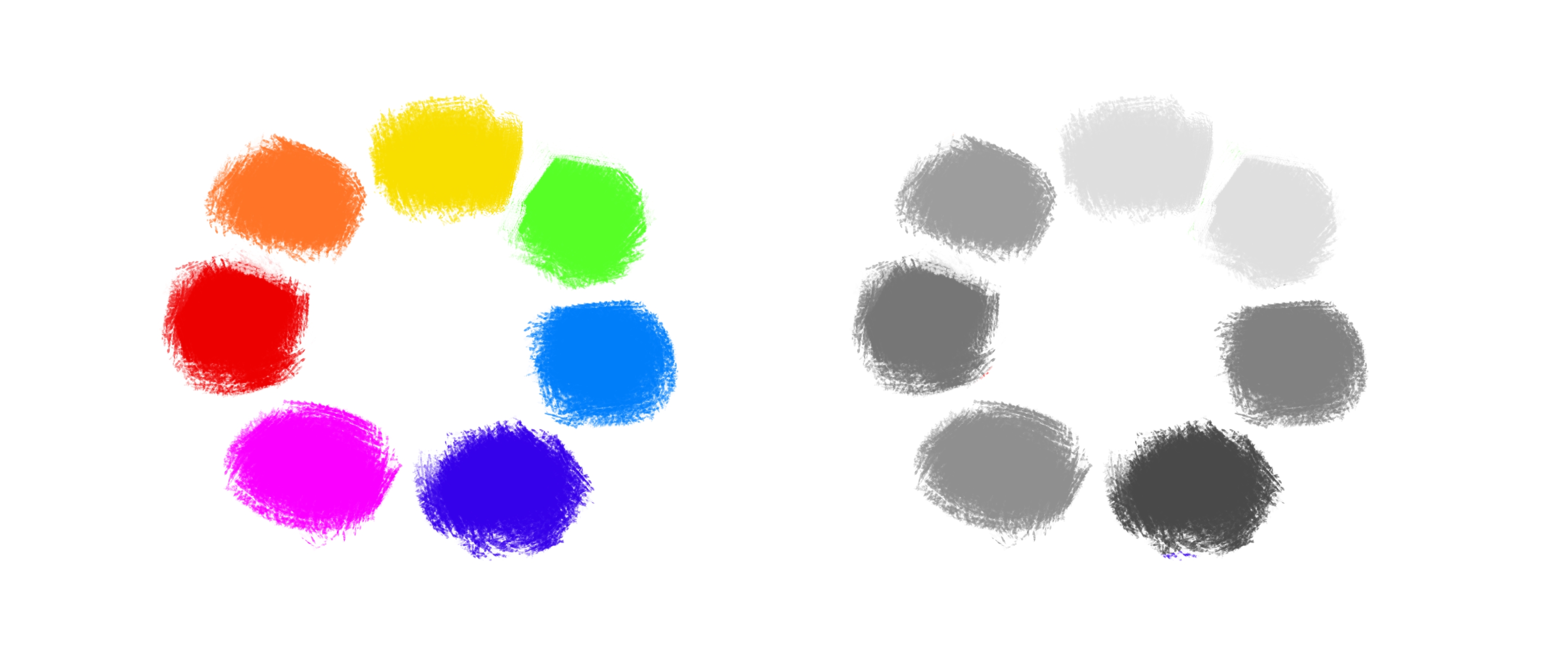
It is really important to realize this, and alot of people are actually not familiar with this. But colors have different value levels. Yellow and green have high value while red, purple and blue have dark values. And orange is a bit in between.
Quick note on saturation filters! If you take an image into your editing software and throw a “desaturate” filter on top, you’ll see that the value of the desaturated colors is incorrect, because all their values are the same. This is because it probably took in account the color intensity. The filter I would use in Krita is a Hue/Saturation/Luma adjustment which is more correct if you turn Luma a bit up.
Why is this important?
Well, understanding the value of colors in your painting helps you choose the correct colors when painting from life. For example, you want to paint a sunset with a red moody sky and a figure wearing a bright yellow jacket standing in front. You’re really struggling because no matter what you do it looks as if yellow jacket is glowing! You try to make the jacket darker by adding black, but now you’ve got this very ugly yellowish brown jacket! The simple reason why, is because yellow is a lot brighter than red. What would fix this is either desaturating the yellow a bit and then turn down the value, or choosing a darker color closer to orange. In relation with the red, you still get the effect that you are looking for. Here we’re also touching unto Color Temperature and how colors relate to each other. This we’ll dive into later as well.
Composition!
The other very important reason is that value determines a lot in your composition. You probably can remember a painting or drawing where you were sucked right in the story it was telling you. First you look at the most important thing happening and slowly you discover more and more in the painting. This is because the composition was made in such a way that you’re attention was unconciously drawn to where the painter wanted you to look at. All this is done by choosing the correct framing of your subject, but also by choosing the correct value.
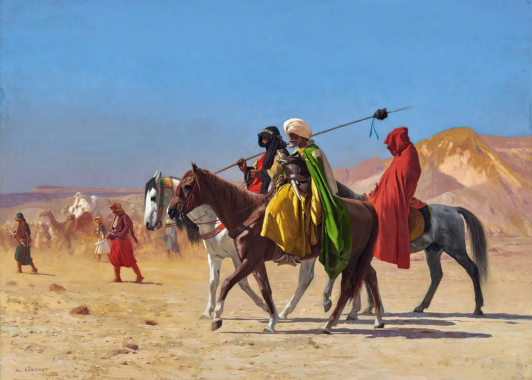
Take a look at this amazing painting by Jeon-Leon Gerome called “Riders crossing the desert”, painted in 1870! You can see how the figures in front really stand out because of their bright colors and sharp contrast, even though the background is still quite colorful!
Now watch what happens when I desaturate this painting…
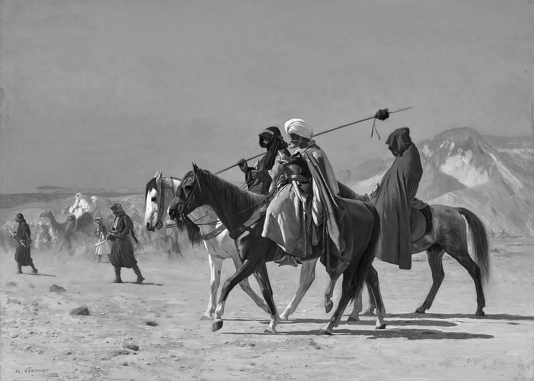
The sky, the ground and the figures in the background become almost a completely uniform in their light grey color. But the figures in front become dark silhouettes! So not only do the figures in front stand out because of their bright colors, but also because their dark values are a stark contrast onto the light background. They are bright and dark at the very same time!
Let’s look at another good example, but change it so you can see when it goes wrong.
This is a lovely landscape painting by Thomas Moran, painted in 1917 called “Sunset cloud, Green River, Wyoming”. The subject is clear, it is the iconic mountain in the background. The composition works well, because the light of the setting sun makes it stand out, and the bright cloud draws your attention to this part of the painting. As an exercise, try and discern the values and rank which ones are the brightest and which ones are the darkest, before scrolling further down.
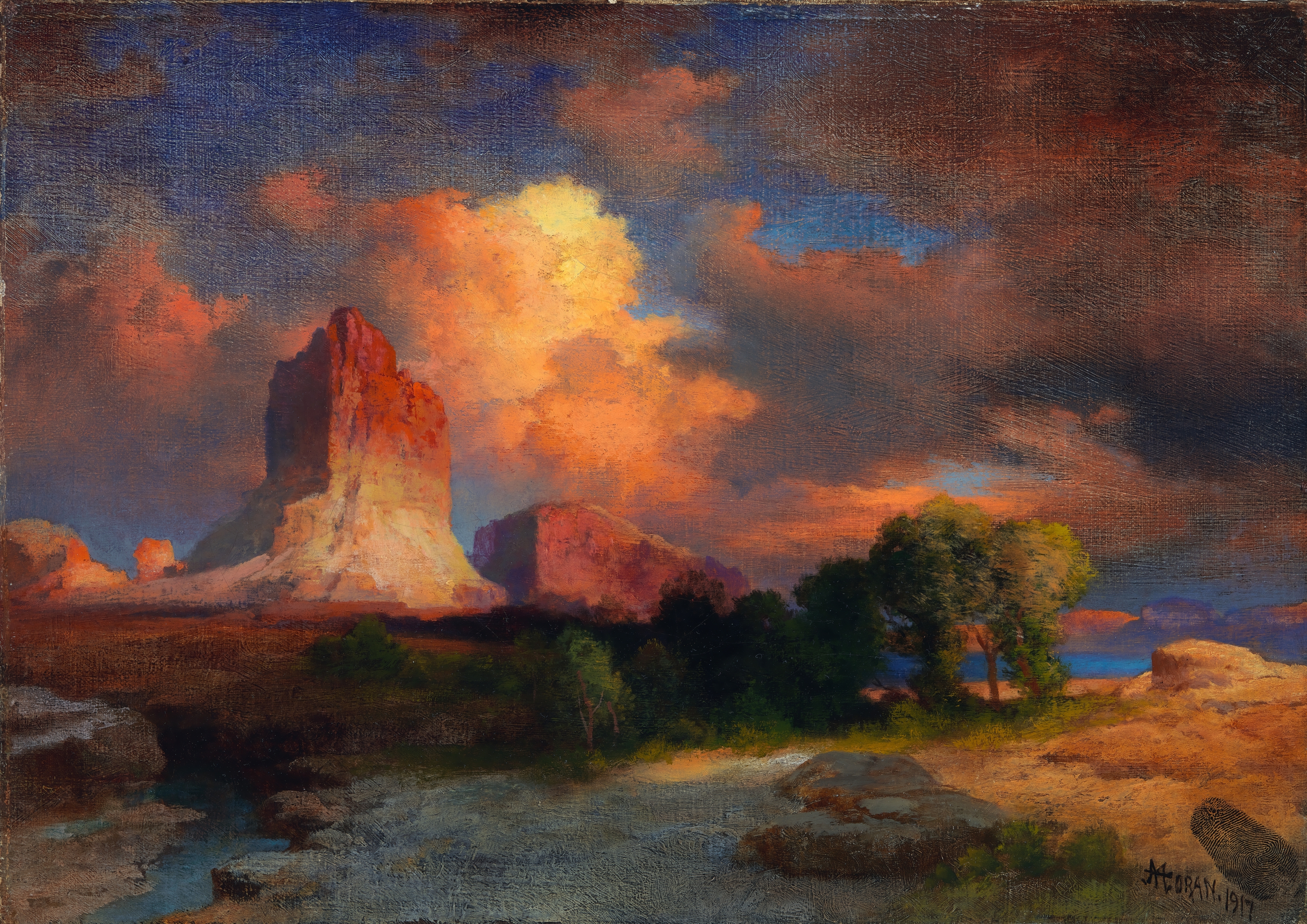
If you look at the foreground, there is a bright spot where the sun shines on the rocks. You’d be totally forgiven if you’d think this would be in the same value range as the mountains in the background, because it looks quite bright. But…
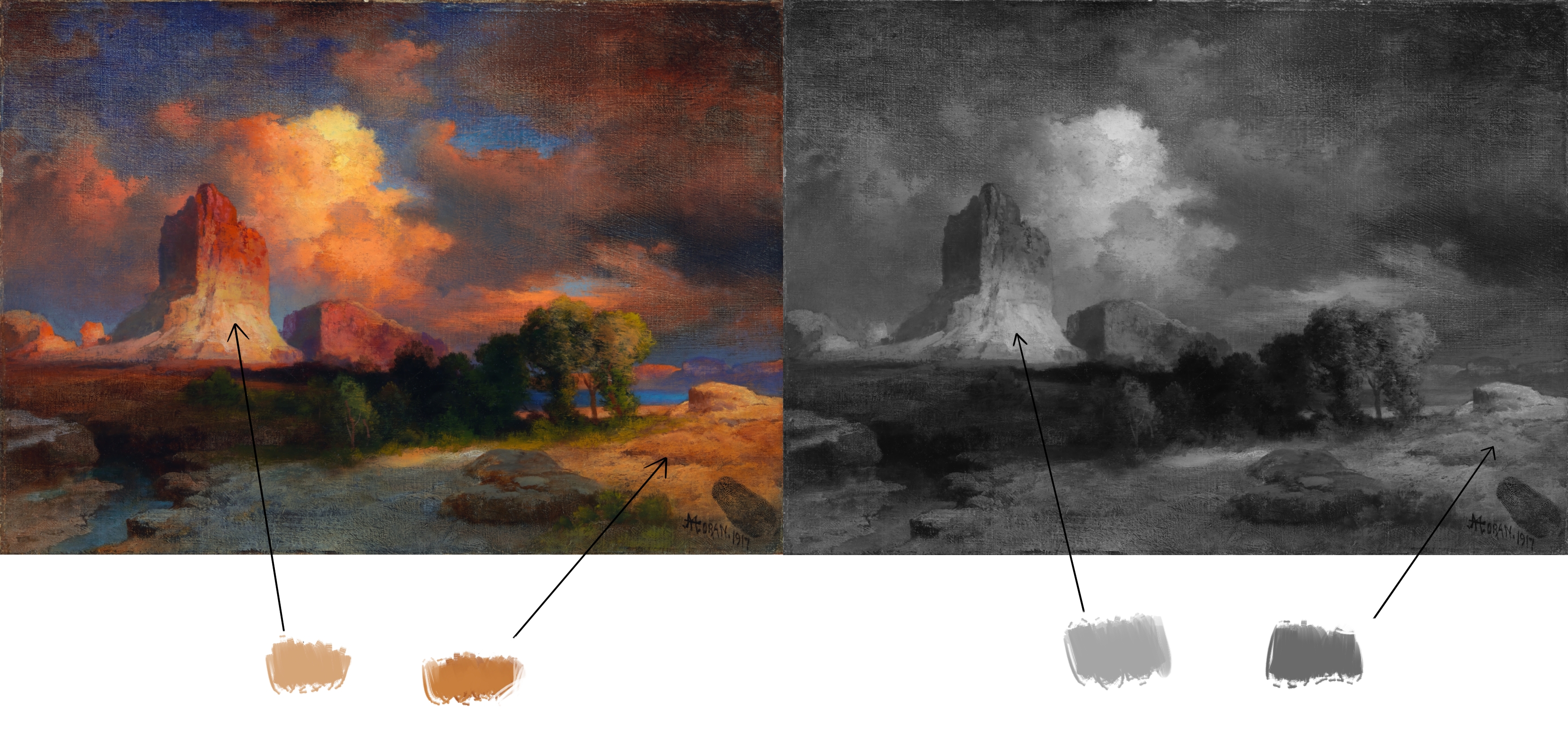
As you can see, it is actually much darker. How can this be? Well, because the bright spot on the foreground is surrounded by dark, blueish shadows, creating a stark contrast in color and value. It is the relationship with its surrounding elements that makes it look bright, but it is actually a bit of an optical illusion. This is something you can utilize to great effect in your own paintings.
Now, let’s change this painting so that the bright spot on the foreground actually has the same value as the mountain on the background…
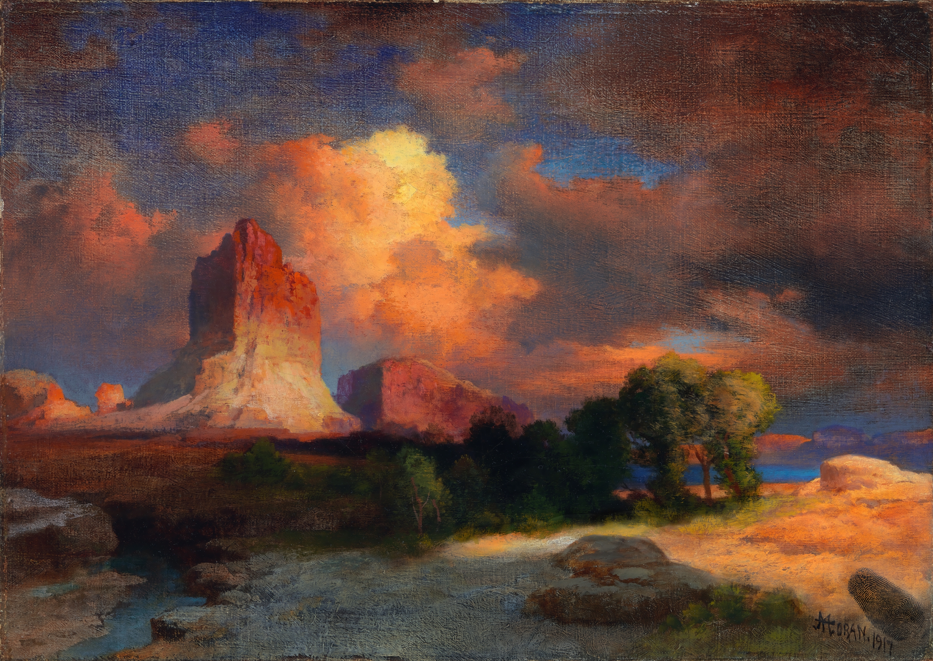
It looks a bit off… It doesn’t seem so likely that the sun is shining so bright on that small spot. Additionally, it’s quite likely that your attention drifted immediately to the foreground, and afterwards it was kind of split between the background and the foreground. The focus in the image has been weakened, not certain of what the most important part of the painting is. After all the painting is called “Sunset cloud” and not “Bright spot in foreground”.
The exercise
So now, finally, the exercise! I hope you’re still with me. We’re again going to do a Notan exercise, but this time using five colors: darkest (close to black), dark, medium, light, lightest(close to white). You can do black and white, or choose one color with four values, or choose two colors; one for the darkest and for the lightest colors. Blue for dark and yellow for light is a good pick, do whatever you like. You are going to choose one of the prompt images I’ve given you. This time I’ve chosen paintings from old masters, because they had an excellent understanding in general of this subject, and because these pictures are all in the public space. It’s a mix of landscape paintings, which are a bit easier to exercise with since they have lots of abstract shapes, and a few portraits for those would like to exercise with that subject. I’d like you to recreate the painting, but only the big shapes. Forget the details like small houses, ships and trees, they are not important! The goal is not to create a masterpiece, but to deconstruct the values.
Important tip: Look at the picture and squint your eyes, this will really help you differentiate the values in the picture.
Down below you can see how I went to work.I chose two colors to work an orange shade and a purple shade. As you can see, the entire mountain range furtest away disappears in the same color as the sky. That is the nature of this exercise, that by choosing only five values you need to make choices for the values in between. Somethings will get lost. I didn’t bother too much with very precise details, just rough shapes. It’s an exercise, its allowed to be rough.
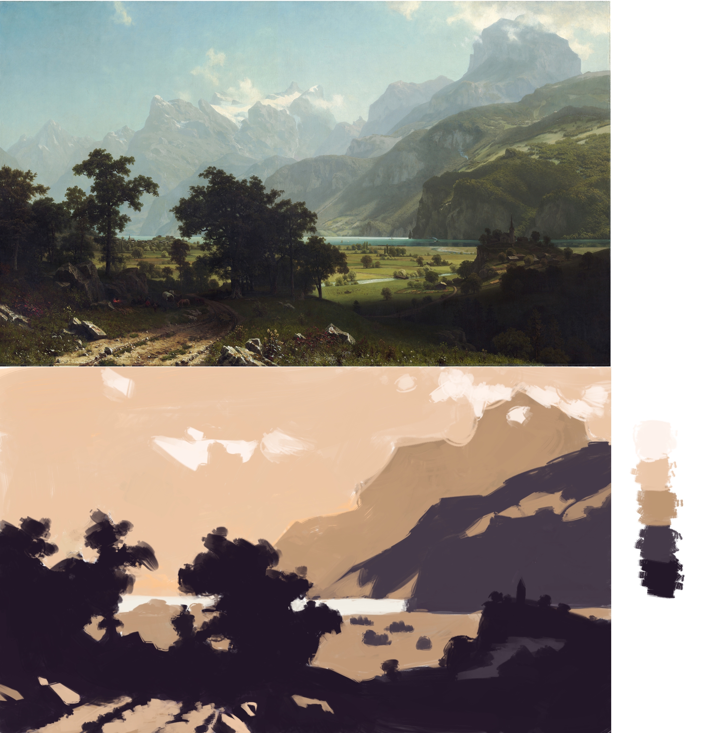
Albert Bierstadt, Lake Lucerne, 1858
When you’re done, post your image to Mastodon using the #MastoArtStudyNumber5 or #MastoArtStudy5 hashtag (I’m thinking of changing the # convention a little bit).
Deadline!
This exercise is a good deal harder than the previous ones, which I why I’m going to give you two weeks to complete it, so thursday the 9th of february. So good luck! I’m looking forward to seeing your entries!
Giving and receiving constructive feedback
Now a big point of #MastoArtStudy is giving each other constructive feedback. This does not mean bashing somebody over the head with what they did wrong, but rather pointing out what the artist did right in the drawing and pointing out the area’s where the artist could improve. Now when receiving constructive feedback, don’t take it personally. The feedback is meant to help you improve. We all have to improve, that’s why we’re doing these studies. So try to refrain from making excuses or explanations for the area’s other artists point out where you should improve, listen and set goals for your next drawing based on the feedback you’ve received.
If you really don’t want to receive feedback, but you still want to share your exercise sketch using the #MastoArtStudyNumber5 hashtag, then please write No feedback in your post.
Now with that said, good luck everyone and see you in two weeks!
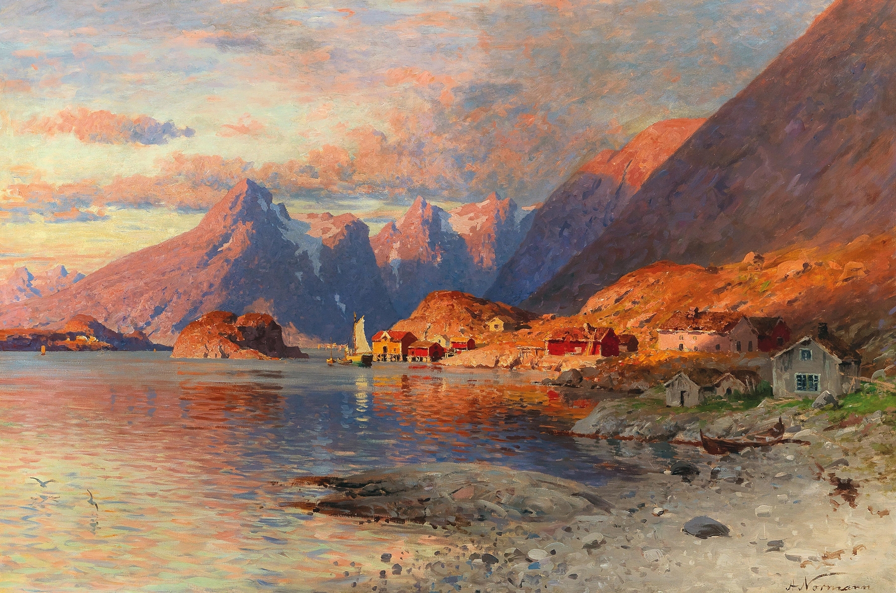
Adelsteen Normann, Fjordlandscape at sunset, 1848–1918
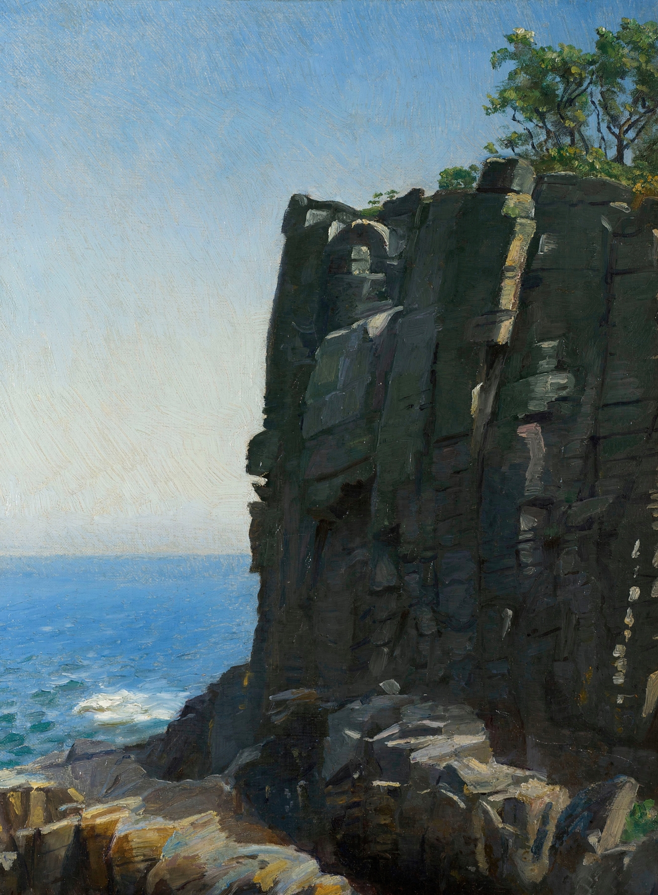
Michael Ancher, Sanctuary cliffs at Rø, 1890
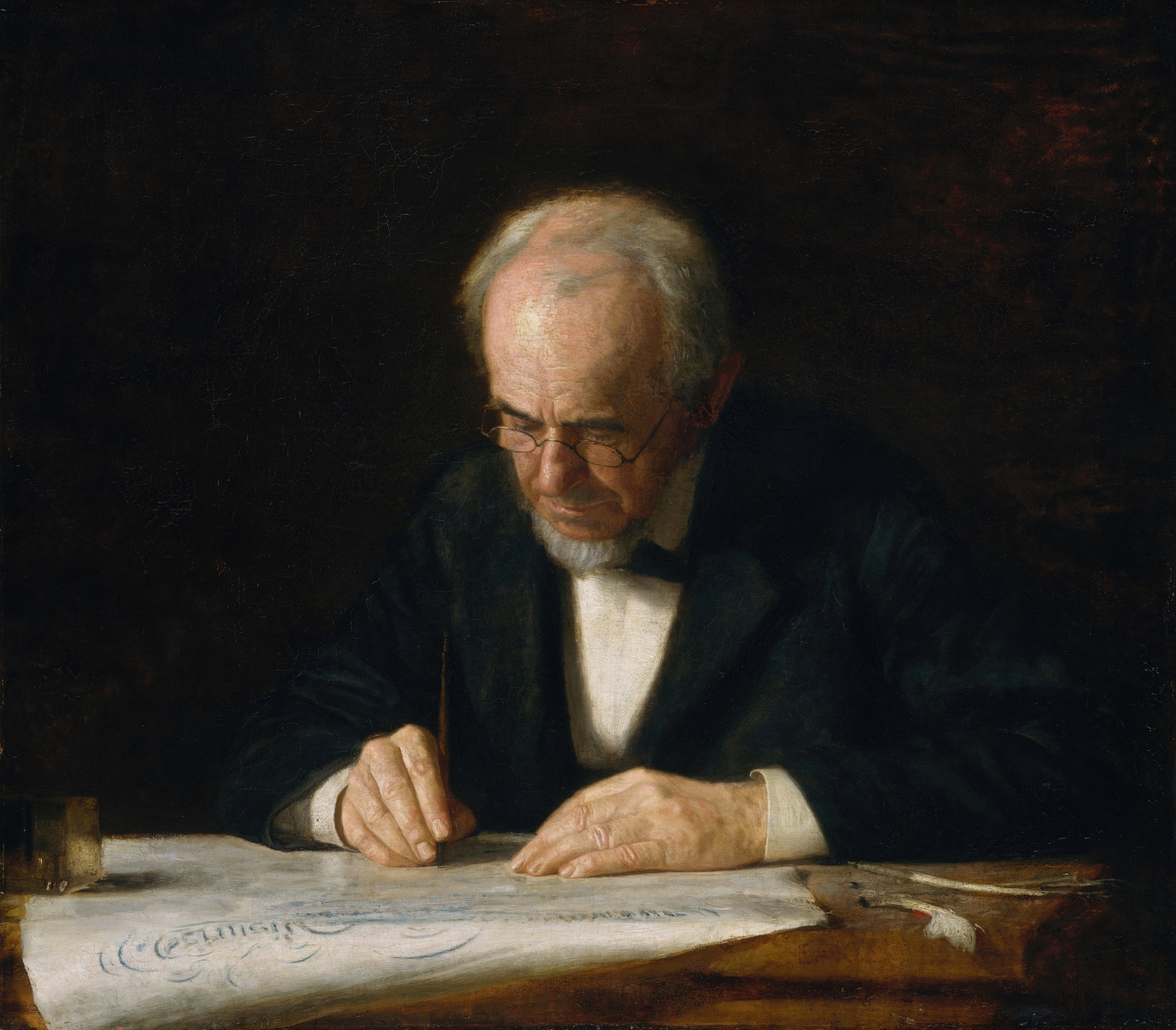
Thomas Eakins, The Writing Master, 1882
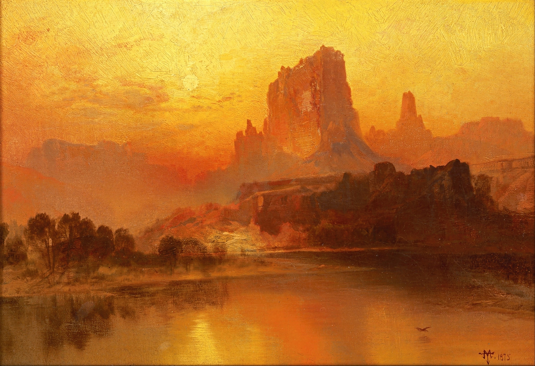
Thomas Moran, The Golden hour, 1875
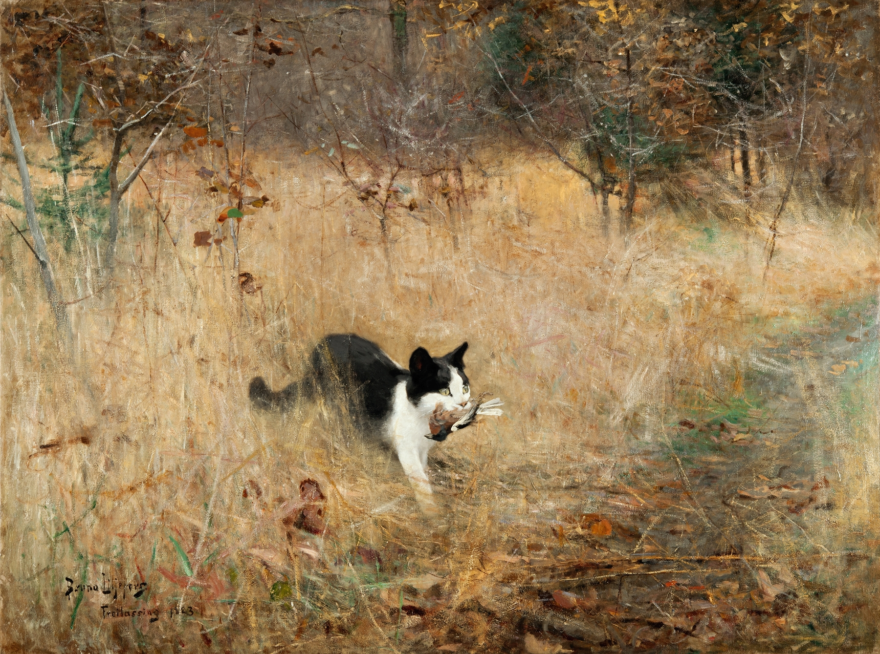
Bruno Liljefors, Cat hunting birds, 1883
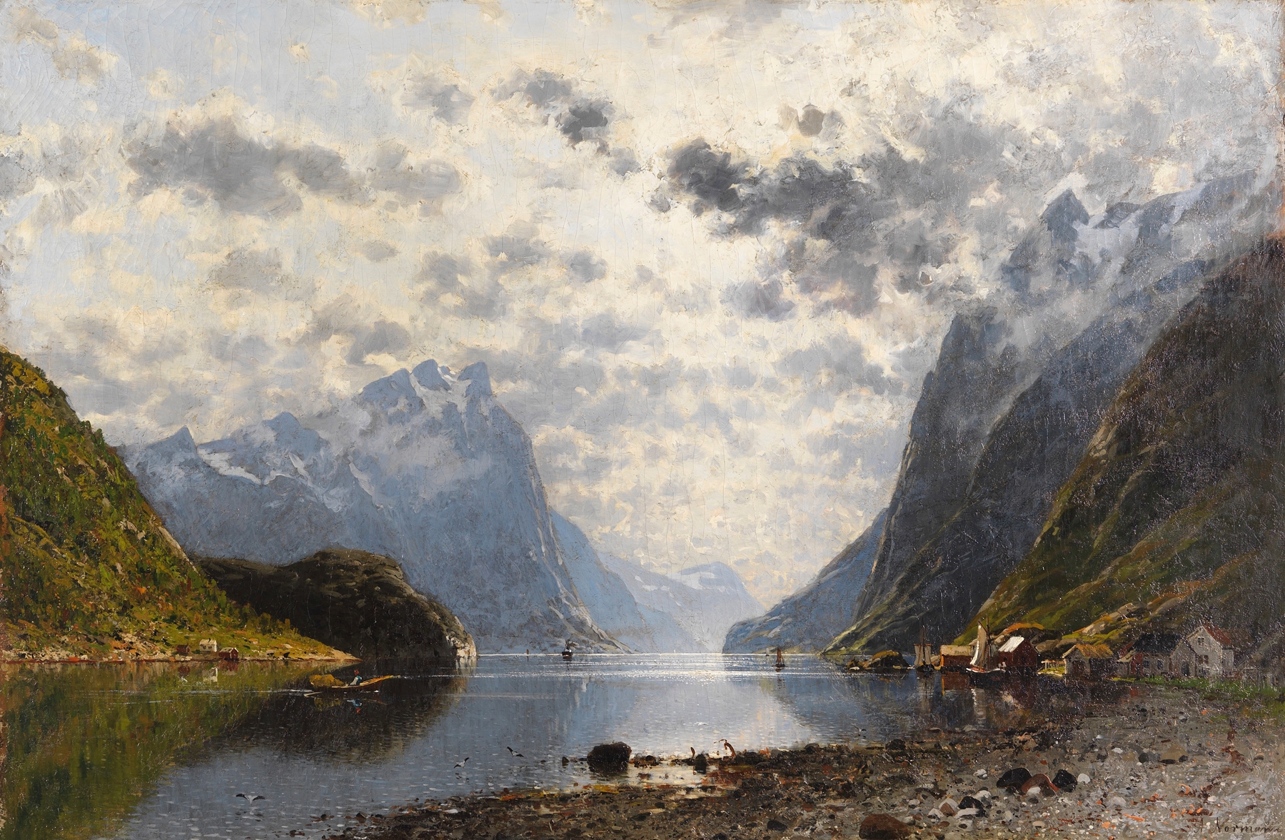
Adelsteen Normann, Norwegian Fjordlandscape, 1880–1890
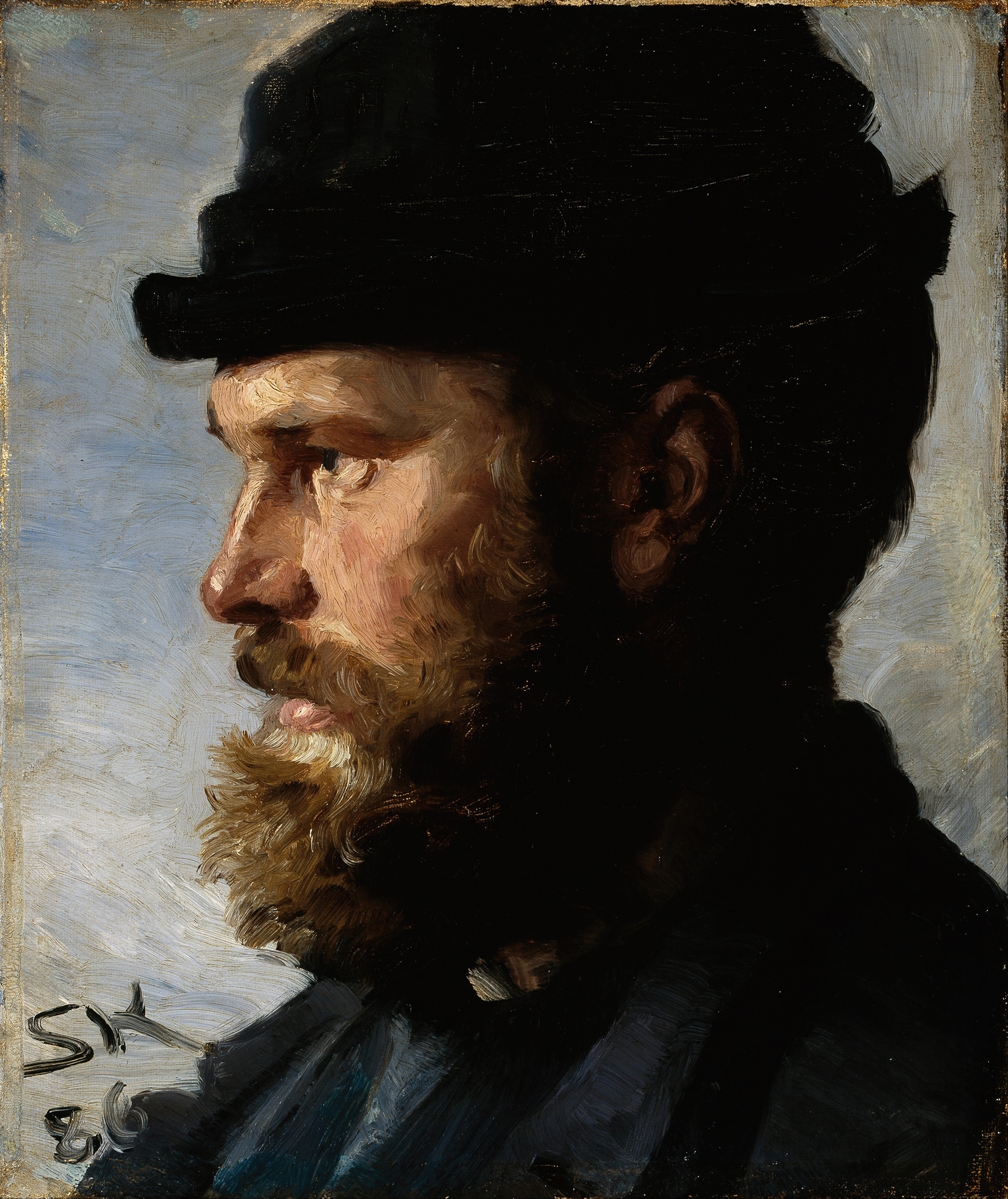
Michael Ancher, Portrait, 1886
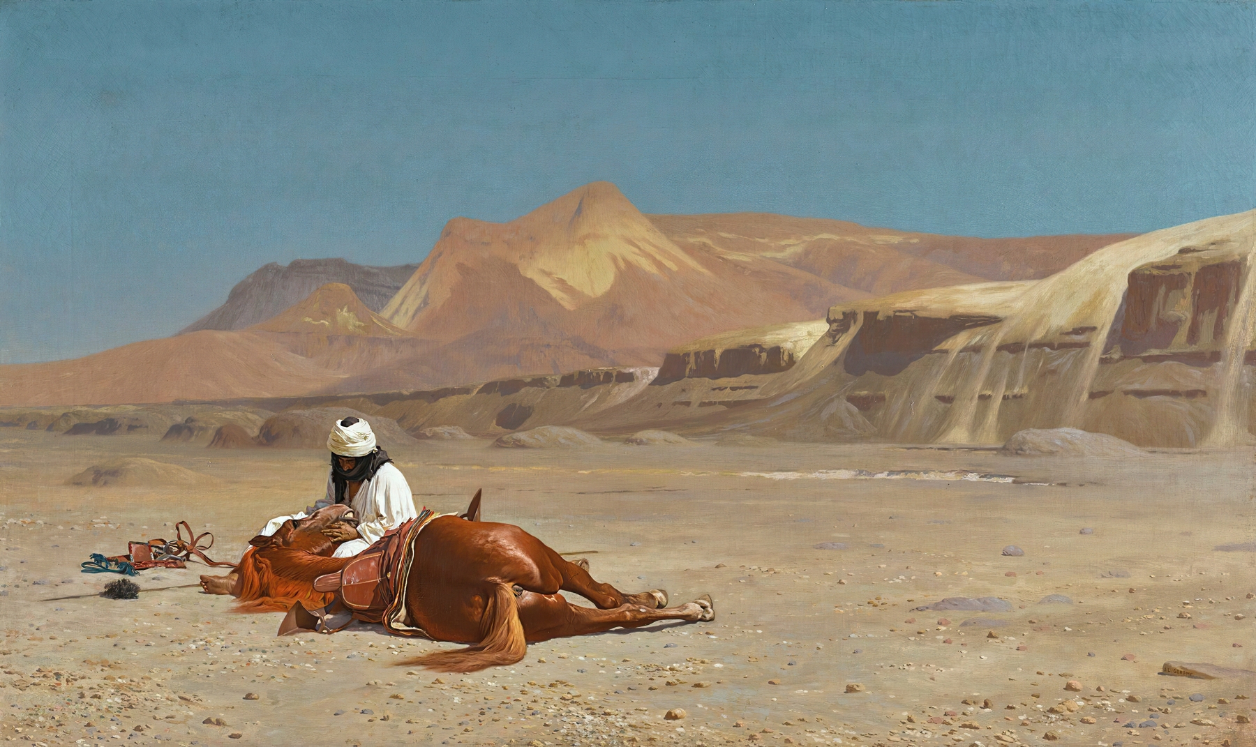
Jean-Leon Gerome, Rider and his steed, 1824–1904
Thomas Moran, Sunset cloud, Green river, Wyoming, 1917