#MastoArtStudy Exercise N04
So we’ve been practicing drawing our forms the last weeks, but now we’re going to try the next step. This time we’re going to delve into shading; understanding the values of light and dark.
The biggest mistake I made in my earlier works was that my lighting was quite often off. It usually was too flat and light, probably because I was used to painting with watercolor. Watercolor gives so much texture to the painting that it quite often doesn’t matter that much. But when I started painting digitally, my paintings lacked depth. They were either too light or too dark. I discovered that I got the best results when I had areas in my painting that almost reached pure white and areas that almost reached pure black. In order to build this understanding of light and shadow we have to practice our understanding of value.
What is value?
Imagine if your looking at a black and white photograph. If you would map out the colors from black, to grey, to white, than this is your value scale. All colors have value. A leaf may be green, but a shadow on a leaf is darker green than the part that is lit up. However, knowing when a color is dark and when it is light, isn’t always as easy as you would think…
The terminator
No, not the movie from the 80’s of the same name, but the area where light goes over into shadow. Sometimes the terminator is very easy to see, like a box lit up with a strong light side, and the other side that is in the dark. On a ball, however, the terminator is a smooth area where the shadow passes over into the light side. This area we call a gradient, a smooth transition from one color into another.

An apple study of mine with a soft gradient
I see a lot of beginner artist often make the mistake to make everything “pretty” by painting soft gradients. Everything is covered in these hazy non-distinct shadows. If you’re good at it, it might work, but more often than not, the picture becomes muddy and uncanny. A painting is quite often a lot stronger when you dare to place distinct shadows. In fact your picture doesn’t have to have a single gradient for it to look good. However, for that to work you have to learn where you are going to place the terminator in the gradients. There isn’t an exact rule for that, but it always somewhere around the middle of the light part and the shadow.
The exercise
We are going to practice so called Notan drawing. A japanese term, describing the relation of light and dark in your composition. You are only allowed to use one color: pure black! And your going to draw/paint on pure white! Here are two examples:
same apple study, but with a Notan drawing to the right.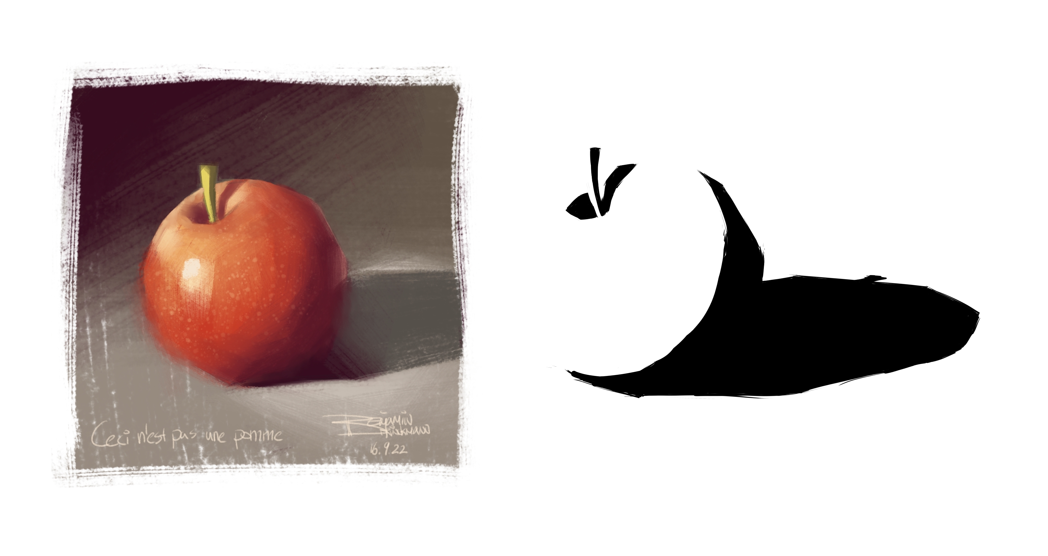

Photograph of lion by Pixabay, taken from Pexels. If you would study the Notan drawing closely you’d see it isn’t a complete copy. I have definitively taken some artistic choices on where to place the shadows, to make the shapes more recognizable.
Why do we do this exercise? Because it forces you to look at a painting and determine what is light and what is dark. You’ll find trickier than you think. One very good tip is to squint your eyes. This definitively helps you distinguish them!
I want you to pick one of the prompt images down below, study it carefully, and only draw the shadows. You are not allowed to draw gradients! If there is an area that has a soft gradient, than determine where you want to place your terminator. I advise to make a sketch of all the major shapes first and place your shadows on it afterwards. Also think of your shadows as major shapes! Digital Artist; this exercise is also brilliant to practice your lasso-drawing skills!
When you’re done, post your image to Mastodon using the #MastoArtStudyNumber4 hashtag.
We’ll set a (not too hard) deadline for ourselves on tuesday 17th of January, 2022. Then in the following week we’ll take the time to comment on each other artworks. I will do my best to see all of the post, but I can’t promise I can comment on every one of them. But don’t wait for me, please engage with the other artists as well.
Giving and receiving constructive feedback
Now a big point of #MastoArtStudy is giving each other constructive feedback. This does not mean bashing somebody over the head with what they did wrong, but rather pointing out what the artist did right in the drawing and pointing out the area’s where the artist could improve. Now when receiving constructive feedback, don’t take it personally. The feedback is meant to help you improve. We all have to improve, that’s why we’re doing these studies. So try to refrain from making excuses or explanations for the area’s other artists point out where you should improve, listen and set goals for your next drawing based on the feedback you’ve received.
If you really don’t want to receive feedback, but you still want to share your exercise sketch using the #MastoArtStudyNumber4 hashtag, then please write No feedback in your post.
Now with that said, good luck everyone and see you next week!

Photograph by Pixabay, taken from Pexels.

Photograph by Marco Antonio Victorino, taken from Pexels.
Photograph by Mathias Reding, taken from Pexels.

Photograph by Jimmy Chan, taken from Pexels.
Photograph by Andreea Ch, taken from Pexels.

Photograph by Karolina Grabowska, taken from Pexels.